K-Means Analysis
Introduction
To observe patterns and relationships amongst the top songs on Spotify, unsupervised learning was utilized through \(k\)-means analysis. \(K\)-means analysis includes assigning each track to a distinct group based on similarities in track features; thus, the purpose of clustering is to see if there are any distinguishable “groupings” between different tracks. Through cluster analysis, we hope to see if there are specific track features that have a larger impact on a track’s popularity. For instance, we often think that more “hype” songs have a higher likelihood of being popular than slower, more melancholy songs; in this case, we would expect that clusters with a higher popularity would also score higher on danceability and energy.
Because \(k\)-means analysis can only be conducted on numerical data, all qualitative variables were removed. Then, the data was standardized to ensure that no one variable had a significant impact on the clustering. For example, track_popularity was recorded on a much larger scale (0-100) than the other variables, which were on a scale from 0-1. Then, an elbow plot was constructed to see the optimal amount of clusters to conduct the \(k\)-means analysis. Finally, visualizations were generated to see differences amongst clusters.
To conduct the data wrangling and analysis for the \(k\)-means clustering, the following packages were used:
- tidyverse by Wickham et al. (2019)
- purrr by Wickham and Henry (2023)
- broom by Robinson et al. (2024)
- ggplot2 by Wickham (2016) - to create the elbow plot to determine the optimal amount of clusters
- GGally by Schloerke et al. (2024) - to generate visualizations for the \(k\)-means analysis
- citation by Dietrich and Leoncio (2023) - to generate citations
Variables
From the tidytuesday Spotify dataset by Thompson et al. (2020), 13 variables were used.
- track_popularity: ranging from 0 (least popular) to 100 (most popular)
- danceability: ranging from 0.0 (least danceable) to 1.0 (most danceable), determined based on tempo, rhythm stability, beat strength, and overall regularity
- energy: ranging from 0.0 (less energetic) to 1.0 (more energetic), determined by dynamic range, perceived loudness, timbre, onset rate, and general entropy
- key: the estimated overall key of the track, where 0 = C, 1 = C#, 2 = D, and so on
- loudness: the average loudness in decibels
- mode: the modality of a track, either 1 (major) or 0 (minor)
- speechiness: the presence of spoken words in a track, ranging from 0 (non-speech-like tracks) to 1.0 (exclusively speech-like)
- acousticness: ranging from 0.0 (low confidence the track is acoustic) to 1.0 (high confidence)
- instrumentalness: predicts whether a track contains no vocals, ranging from 0.0 (lower likelihood of no vocal content) to 1.0 (higher likelihood); “ooh” and “aah” are treated as instrumental
- liveness: detects the presence of an audience, ranging from 0.0 (low probability the track was performed live) to 1.0 (high probability the track was performed live)
- valence: describes the musical positiveness conveyed by the track, ranging from 0.0 (more negative) to 1.0 (more positive)
- tempo: the average tempo in beats per minute
- duration_ms: duration of the song in milliseconds
Elbow Plot
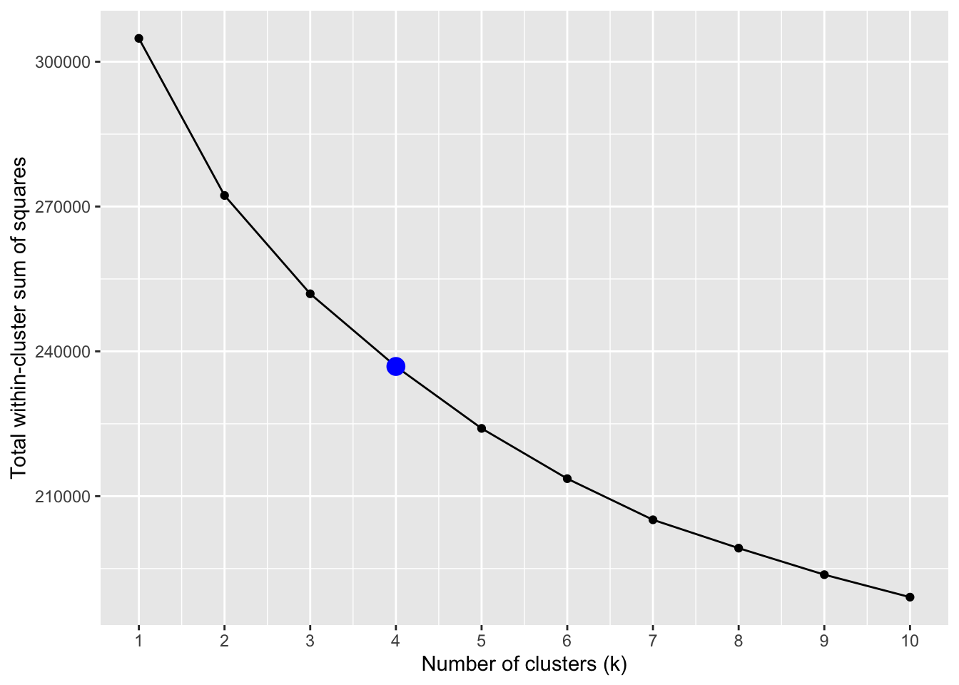
The elbow plot indicates that there are no significant drops in the total within-cluster sum of squares after 4 clusters (the highlighted point), so 4 clusters was used for our \(k\)-means analysis.
Visualizations
For clearer visualization, four separate plots were generated to visualize the differences between clusters, with each plot comparing three different variables with popularity scores. Click through the tabset panels to explore the different visualizations. The title of each panel indicates the three variables that were used to compare clusters and popularity scores. Each cluster is separated by color.
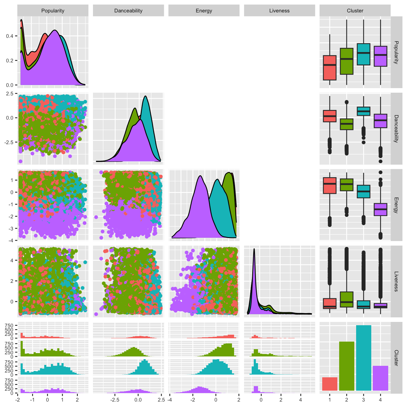
All four clusters had relatively high danceability scores, with cluster 3 having the highest and cluster 2 having the lowest. Cluster 4 had the lowest energy score, while cluster 3 had the second lowest. Clusters 1 and 2 had similarly high energy scores. All four clusters had low liveness scores.
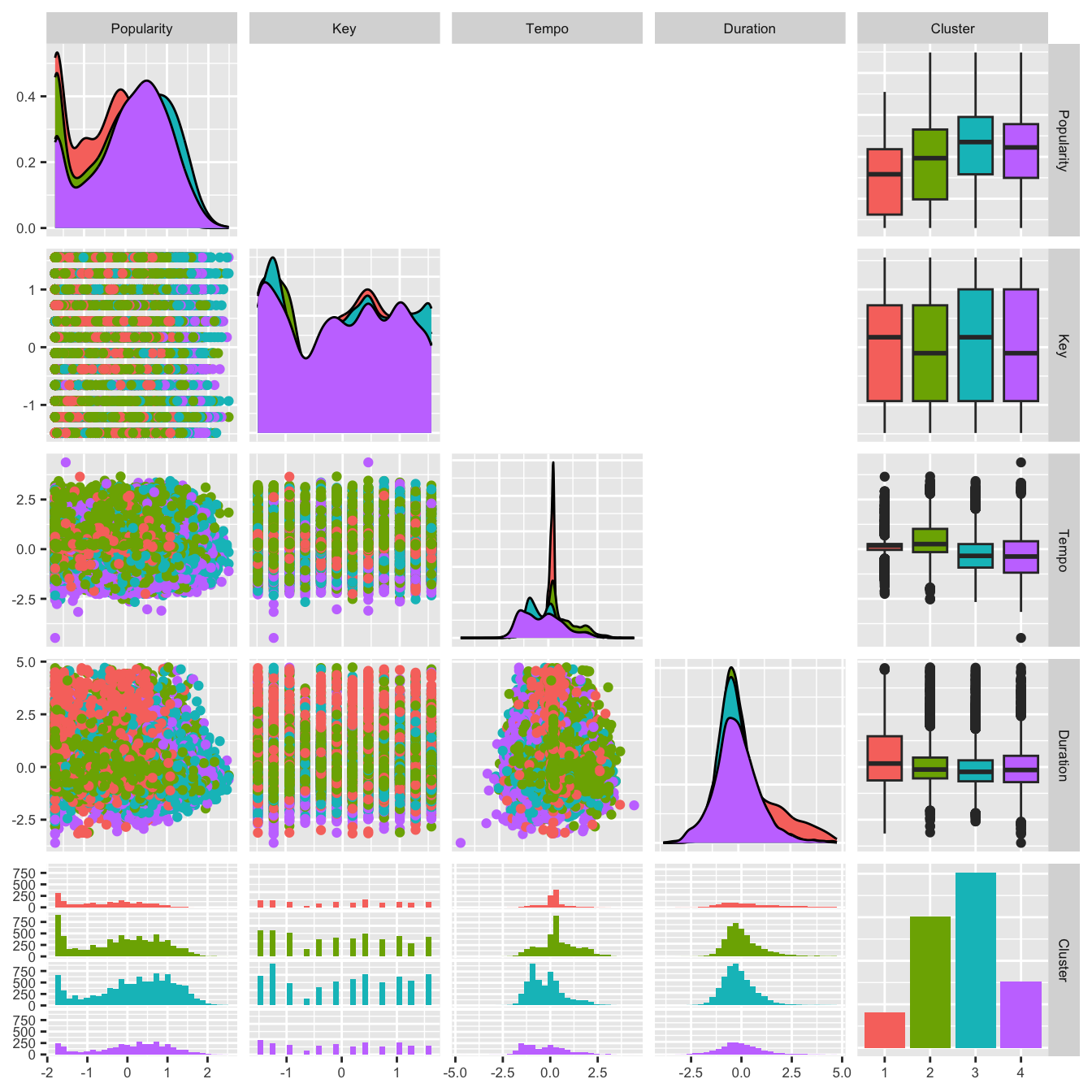
There were no significant differences in the key, tempo, and duration of the four clusters.
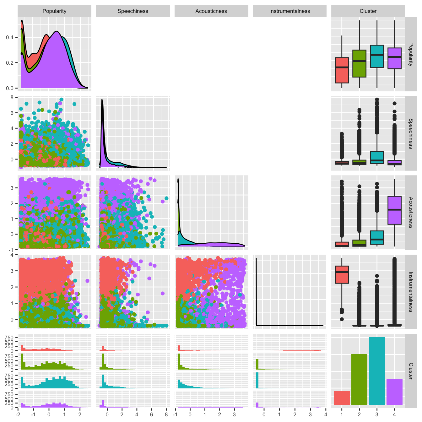
All four clusters had extremely low speechiness scores. Clusters 1 and 2 had low acousticness scores, with cluster 3 having a slightly higher score, and cluster 4 having a substantialy higher acousticness score. Clusters 2, 3, and 4 had extremely low instrumentalness scores, while cluster 1 had an extremely high instrumentalness score.
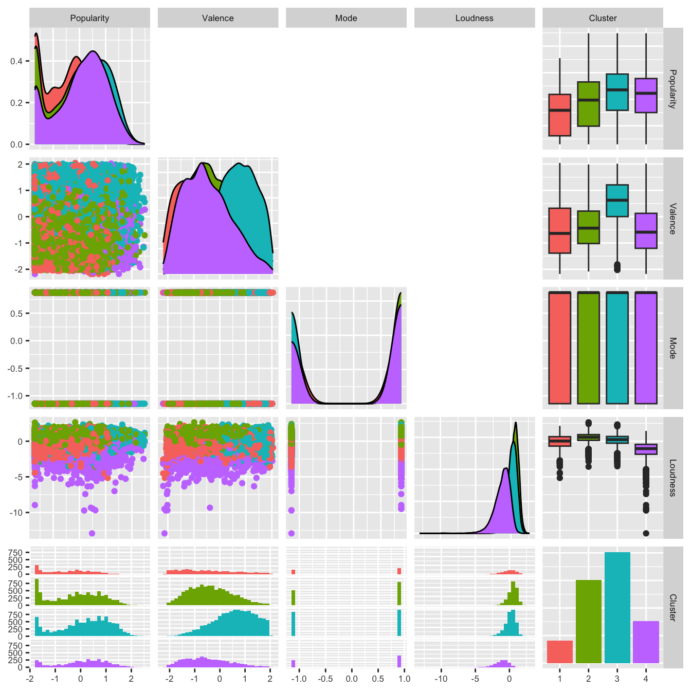
Clusters 1, 2, and 4 had similar valence scores, while cluster 3 had a higher valence score. There was no difference in the mode of the four clusters. Clusters 1, 2, and 3 had similar loudness scores, and cluster 4 had a slightly lower loudness score.
Overall, there was no significant difference in the popularity scores of the four clusters. The order of the popularity scores (from highest to lowest) is cluster 3, cluster 4, cluster 2, cluster 1. The most notable differences between clusters included:
- Cluster 4 had a much lower energy score
- Cluster 1 scored much higher on instrumentalness
- Cluster 3 scored relatively higher on valence
Conclusion
While no significant conclusions can be drawn, the \(k\)-means analysis suggests that more popular songs tend to score higher on valence. This means that consumers tend to like tracks that are more positive, compared to those that carry a negative tone. Additionally, less popular songs scored much higher on instrumentalness, which suggests that consumers tend to gravitate towards tracks with more lyrics and vocals.
References
Dietrich, J. P., and Leoncio, W. (2023), Citation: Software citation tools.
Robinson, D., Hayes, A., and Couch, S. (2024), Broom: Convert statistical objects into tidy tibbles.
Schloerke, B., Cook, D., Larmarange, J., Briatte, F., Marbach, M., Thoen, E., Elberg, A., and Crowley, J. (2024), GGally: Extension to ’ggplot2’.
Thompson, C., Parry, J., Phipps, D., and Wolff, T. (2020), “Spotify songs,” Available at https://github.com/rfordatascience/tidytuesday/blob/main/data/2020/2020-01-21/readme.md.
Wickham, H. (2016), ggplot2: Elegant graphics for data analysis, Springer-Verlag New York.
Wickham, H., Averick, M., Bryan, J., Chang, W., McGowan, L. D., François, R., Grolemund, G., Hayes, A., Henry, L., Hester, J., Kuhn, M., Pedersen, T. L., Miller, E., Bache, S. M., Müller, K., Ooms, J., Robinson, D., Seidel, D. P., Spinu, V., Takahashi, K., Vaughan, D., Wilke, C., Woo, K., and Yutani, H. (2019), “Welcome to the tidyverse,” Journal of Open Source Software, 4, 1686. https://doi.org/10.21105/joss.01686.
Wickham, H., and Henry, L. (2023), Purrr: Functional programming tools.