Network Map w/ Additional Visuals
You’re Here To…
To explore connections between artists among top Spotify tracks, we used network science to construct and analyze a collaboration network. In this network, each node represents a unique artist, and edges connect artists who have worked together before. By modeling these relationships as a network, we can observe how artists cluster together, which artists are central to the network, and how collaboration patterns vary across the music industry.
Network analysis helps us do more than just count how many times artists worked together, it allows us to actually see how those collaborations are structured. By looking at the network, we can figure out which artists play important roles, like being central connectors between groups or part of particular circles that collaborate a lot. For example, we might expect pop artists to be part of big, connected clusters because they tend to collaborate more often, while artists from smaller or more niche genres might be more on the edges of the network. Given the use of this spotifyr dataset, when filter for top our tracks, a majority of the songs are pop genre, thus we will see many connections in the dominating pop genre circles.
To create the network, we first scrapped and downloaded information from Wikipedia to gain an understanding of which artist have crossed paths professionally. Then that data was filtered to include only unique artist-to-artist collaborations. Then, we used visualizations using degree centrality to highlight popular artists amongst those groups to examine the overall connectivity of the network. Through this analysis, we hope to gain insight into how collaborative behavior influences visibility, crossovers with genre, and the formation of musical communities or pods.
To further contextualize these relationships, we added a geographic layer: an interactive map showing each artist’s hometown. The Artist in this dataset come from USA, Canada, and South America is shaded by the number of artists from that area, and users can hover to explore who’s from where. This data required Wikipedia site pulling and location extraction from page scrolling. Once collected, these hometown countries and provinces were merged with spatial features geometry data from geodata package using level 1, administrative level to gain fillings for the leaflet map consisting of states, provinces, and department borders within continent borders.
To complement the visual analysis, we created a table that counts how often each artist was mentioned in the dataset — either as a main or featured artist. This provides a fast way to identify who appears the most across top tracks, and gives insight into both popularity and industry presence.
Visuals
Map - To display hometowns of artist Table - To show what artist has had the most top tracks in spotify Network - To show which artist have worked together (and more specifically who are the most connected/ hottest collaborators)
Packages: To conduct the data wrangling and analysis for this page, the following packages were used:
tidyverseby Wickham et al. (2019)rvestby Wickham (2024)ggplot2by Wickham (2016)stringrby Wickham (2023a)purrrby Wickham and Henry (2023)robotstxtby Baltazar et al. (2024)tidytextby Silge and Robinson (2016)tidyrby Wickham et al. (2024)dplyrby Wickham et al. (2023)spotifyrby Thompson et al. (2024)GGallyby Schloerke et al. (2024)ggraphby Pedersen (2024a)tidygraphby Pedersen (2024b)httrby Wickham (2023b)leafletby Cheng et al. (2024)ggspatialby Dunnington (2023)RColorBrewerby Neuwirth (2022)kableExtraby Zhu (2024)geodataby Hijmans et al. (2024)citationby Dietrich and Leoncio (2023)
Variables
Number of Variables used: 7 - track_artist: list of all artist who’s songs have made it to the top 100 songs - collabArtist: the names of artist (exclusively artist listed in the top 100) who have worked with (in any capacity) with track artist - track_popularity: spotify used metrics such as total number of plays, recent number of plays, user engagements and other metrics to give songs a popularity score from 0 to 100 - track_name: name of the song - hometown: hometown is distinct from born place, hometown is where the artist grew up - Weight: how many artist were raised in a given location - geometry: spatial data that stored in polygons (boundary areas across the globe)
Home, Sweet, Home
Where are your favorite Artist ? Any Artist A Surprise for you ?
This interactive map shows the geographic distribution of artists based on their hometowns. Each polygon is colored using a choropleth style, where darker shades represent a higher number of artists. When hovering over a region which will then display the names of artists from that area which making the map both informative and interactive.
What stands out immediately is that California, Texas, and Ontario are among the darkest regions, meaning they’ve produced the most artists in our dataset. This makes sense given their large population, metropolitan cities within them like Los Angeles, Houston, and Toronto. Places like these are known for strong music scenes and access to industry infrastructure. Puerto Rico, while small, is also a dark region, showing that it produces a high concentration of artists relative to its size. Another important observation is the absence or low representation in many central and rural regions. States like North Dakota, South Dakota, and parts of central Canada are nearly blank, suggesting fewer artists with mainstream visibility come from those areas. This raises interesting questions about the relationship between place, opportunity, and exposure. Artists from densely populated or culturally rich areas may have more access to collaboration networks, production studios, or early fan bases. It is important to note that tiktok in recent years has made it much easier for rural, or smaller artist in general thrive more in the music industry than ever before which will seen be reflected once a new cycle of data census is collected surrounding music social media consumption.
Artist Tabling
| Artist | Billboard Hits | Genre | Popularity Spotify Scores |
|---|---|---|---|
| Post Malone | 5 | pop | 87 |
| Billie Eilish | 4 | pop | 95 |
| DaBaby | 3 | rap | 93 |
| Travis Scott | 3 | pop | 94 |
| Ariana Grande | 2 | pop | 87 |
| Camila Cabello | 2 | pop | 87 |
| Daddy Yankee | 2 | pop | 90 |
| Dalex | 2 | latin | 91 |
| Halsey | 2 | pop | 87 |
| Harry Styles | 2 | pop | 91 |
This table presents a ranked list of the most popular spotify artists in our dataset, based on a combination of songs in the dataset and Spotify popularity scores.
This table presents a ranked snapshot of the most prominent artists in our dataset, combining number of songs as count with Spotify popularity scores to offer a layered perspective on the artist. At the top, Post Malone leads with 5 tracks, showing strong mainstream success though his Spotify score of 87 suggests that chart dominance doesn’t always equate to peak streaming popularity. In contrast, Billie Eilish comes in second with 4 song mentions and a high popularity scores of 95. Artists like DaBaby and Travis Scott also rank highly across both metrics, reflecting strong fan engagement and consumption across platforms. Interestingly, artists with fewer chart appearances such as Harry Styles, Camila Cabello, and Halsey still maintain high Spotify scores, emphasizing that streaming success isn’t solely tied to chart frequency. Overall, the table reveals how pop artists dominate in both metrics, with only a few rap and Latin artists appearing.
The dominance of pop artists in this table is striking as the most represented and interconnected genre.
Connections
How Well Are Those Most Popular Artist Connected?
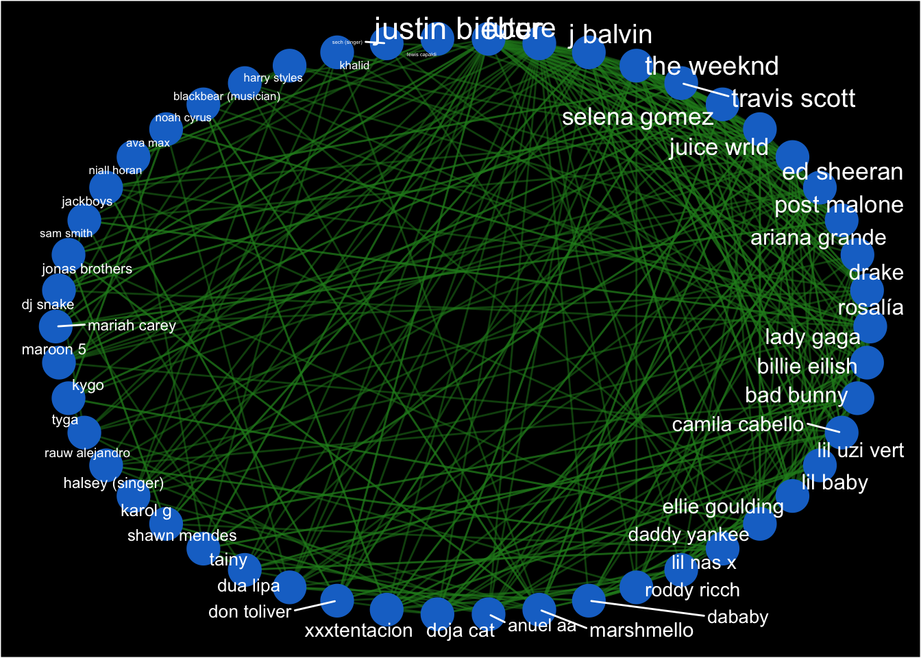
This network graph visualizes how artists in our dataset are connected through collaboration. Each blue circle, a node represents an artist, and the green lines, edges, represent collaborations between them, meaning they’ve appeared together on a track. However, to be explicit those tracks might not be represented in the spotify dataset– these collaborations are beyong the scope of just his data we used. The layout is circular, helping us clearly observe which artists are highly connected and which ones appear less connected. Network maps are very efficient at conveying relationships but if they are indecipherable due to overlaying edges then it does more of the opposite, and might even make the information seem more convoluted– the circular layout fixes that issue. To emphasize influence within the network, we used a metric from our network science unit called degree centrality, which in this context measures how many connections each artist has to others. Artists with higher degree centrality appear with larger labels, visually highlighting who collaborates the most. For example, Justin Bieber, J Balvin, The Weekend, and Travis Scott have noticeably larger names, indicating they are among the most central collaborators in this music dataset. These artists often serve as connectors between clusters, linking pop, hip-hop, and Latin artists together across genres.
On the other hand, artists positioned more toward the left side of the circle, with smaller labels, tend to have fewer collaborations. This could reflect either genre isolation, activity in the industry, preferences, location. less cross genres collaborations and more. While this graph doesn’t capture how strong each connection is, it gives a clear picture of how connected each artist is.
Conclusions
Through exploring this data, we hope you had as much fun as we did learning new things about Artist and the music industry through connections the artist make. From our interactive map, we hope you can see if you want to make music or become famous it might not be a bad idea to set up shop there, in addition to the pop genre takeover might even be in your best interest to produce a pop song or two– while still putting out what you actually want.
The collaboration network revealed that artists like Drake, Travis Scott, and J Balvin are highly central figures, its not something that I knew beforehand. Meanwhile, the top artist table showed names like Post Malone, Billie Eilish, and DaBaby dominating both charts and streams, offering a snapshot of who’s modt at the forefront in listeners’ daily lives.
This is a music fact sheet meant for engagement, entertainment, and information. Whether you are a fan, and inspiring artist, or your just in the mood to fact gauge.
References
Baltazar, P., Meissner, P., and Ren, K. (2024), Robotstxt: A ’robots.txt’ parser and ’webbot’/’spider’/’crawler’ permissions checker.
Cheng, J., Schloerke, B., Karambelkar, B., and Xie, Y. (2024), Leaflet: Create interactive web maps with the JavaScript ’leaflet’ library.
Dietrich, J. P., and Leoncio, W. (2023), Citation: Software citation tools.
Dunnington, D. (2023), Ggspatial: Spatial data framework for ggplot2.
Hijmans, R. J., Barbosa, M., Ghosh, A., and Mandel, A. (2024), Geodata: Download geographic data.
Neuwirth, E. (2022), RColorBrewer: ColorBrewer palettes.
Pedersen, T. L. (2024a), Ggraph: An implementation of grammar of graphics for graphs and networks.
Pedersen, T. L. (2024b), Tidygraph: A tidy API for graph manipulation.
Schloerke, B., Cook, D., Larmarange, J., Briatte, F., Marbach, M., Thoen, E., Elberg, A., and Crowley, J. (2024), GGally: Extension to ’ggplot2’.
Silge, J., and Robinson, D. (2016), “Tidytext: Text mining and analysis using tidy data principles in r,” JOSS, The Open Journal, 1. https://doi.org/10.21105/joss.00037.
Thompson, C., Antal, D., Parry, J., Phipps, D., and Wolff, T. (2024), Spotifyr: R wrapper for the ’spotify’ web API.
Wickham, H. (2016), ggplot2: Elegant graphics for data analysis, Springer-Verlag New York.
Wickham, H. (2023a), Stringr: Simple, consistent wrappers for common string operations.
Wickham, H. (2023b), Httr: Tools for working with URLs and HTTP.
Wickham, H. (2024), Rvest: Easily harvest (scrape) web pages.
Wickham, H., Averick, M., Bryan, J., Chang, W., McGowan, L. D., François, R., Grolemund, G., Hayes, A., Henry, L., Hester, J., Kuhn, M., Pedersen, T. L., Miller, E., Bache, S. M., Müller, K., Ooms, J., Robinson, D., Seidel, D. P., Spinu, V., Takahashi, K., Vaughan, D., Wilke, C., Woo, K., and Yutani, H. (2019), “Welcome to the tidyverse,” Journal of Open Source Software, 4, 1686. https://doi.org/10.21105/joss.01686.
Wickham, H., François, R., Henry, L., Müller, K., and Vaughan, D. (2023), Dplyr: A grammar of data manipulation.
Wickham, H., and Henry, L. (2023), Purrr: Functional programming tools.
Wickham, H., Vaughan, D., and Girlich, M. (2024), Tidyr: Tidy messy data.
Zhu, H. (2024), kableExtra: Construct complex table with ’kable’ and pipe syntax.